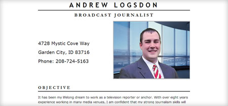
Anchorman
Update: Since the question had been raised - I used Trade Gothic Bold for Andrew's name in the branding. The secondary serif font in the tagline is Garamond, which comes pre-installed on most operating systems. I chose it for the hanging capital "J" because I thought it lended a bit of elegance.
At the risk of type-casting myself, I have done another single page website. This one is for my old college friend Andrew Logsdon. He is a graduate of the Edward R. Murrow school of communication at Washington State University, which I am told is one of the best programs for broadcasting in the nation. He is also working towards a second bachelor of science degree in meteorology.
He recently re-shot an entirely new demo reel in Los Angeles, because his original tape from college had been damaged by movers. Getting into the news business, a good demo reel is like gold - much like a portfolio is for a designer. So, when he decided to actively pursue a career in television broadcasting, I had the brilliant idea that maybe a website would help.
While this site is only one page, it has all the bells and whistles. His demo reel is being streamed in as a FLV file via a tiny embedded SWF player. I am using the handy SWFObject JavaScript written by Geoff Stearns. This is for two reasons: First, to make sure users have the Flash 8 player installed, since it is required to play the new Flash video format. Secondly, it gets around the nasty new multimedia impediment in Internet Explorer versions 6 and 7.
As a fallback contingency plan, I went ahead and added links to download a Windows Media compatible .avi or Quicktime .mov file. These appear when the user either has an incompatible Flash player version, or when JavaScript is turned off. This way, nobody misses out for lack of proper technology. As an added bonus, the movie already has the perfect dimensions for video iPods (320x240 pixels), which play the Apple Quicktime format by default.
Being that this is a site for a journalist, I figured it could do with a good print stylesheet. This is one of the points I am most proud of, as it's something I typically neglect, even for my own site. Below is a screenshot of what the print layout looks like. To encourage printing, I put a JavaScript activated print button pseudo-link with javascript:onclick=window.print(). You could say this is obtrusive and not degradable, but I honestly can't think of a way to mimick this functionality without JS, so it's a moot point.

So yeah, there you have it. Go check out the site, and leave any feedback in the comments of this article. Also, if you know of any TV stations in the Northwest looking to hire a capable reporter or news anchor, please refer them to Andrew's site. I can personally vouch that he is a nice guy, and he obviously has a solid understanding of what it takes to be a good journalist.
