SwordSearcher 9.0 review
It has been a while since I last reviewed SwordSearcher. Quite a bit has changed since then, so I figured it would be good to dive into version 9.0 and cover some of the new functionality.
Brandon Staggs was gracious enough to provide me with a review copy, and I have to say I was pleasantly surprised that it still feels familiar and approachable, while also bringing new features to the table. Though perhaps surprised is the wrong word, since his work has always been impeccable. I will dive into a few of my favorite aspects in this review.
Dark mode
New as of version nine, there is a new dark mode which is nicely done. According to my teenage son, it feels like a code editor for the Bible. The first thing he did was configure his SwordSearcher installation to match the Dracula theme, so it looks like his preferences for Vim and VS Code.
I would have to agree with that assessment. Even with previous versions of SwordSearcher, the layout reminded me of an IDE with multiple ways to look at a particular topic. With the dark theme, it feels more conducive to longer reading sessions and the colored text helps words and subjects to pop off the page. Initially, the app loads the traditional light theme. Clicking the bottom-left icon will switch to the dark theme (and back again).
Note: For the sake of simplicity, I will feature dark mode screenshots for the remainder of this article. Just be aware that all the things I mention are available in both modes.
Search & layout
To say that the search feature is fast would be an understatement. Overall, the speed of UI responsiveness is one thing that has always impressed me about previous versions of this app. When searching, results are nearly instantaneous and there is a tasteful bar chart that shows the frequency of results across the entire Bible.
This screenshot shows a search for the phrase "son of david", with the Bible view on the left and search results on the right. The orange (and blue) rectangles in the image show how often this string of text appears in the various books. As can be seen in the chart, there are more instances of this search result in the Old Testament than in the New Testament. Clicking any of the bars will jump to the first occurrence of the term in its respective chapter.
I have achieved this layout by:
- Closing a few other panes
- Dragging the top bar of the search results
- And dropping it over to the right side
It is difficult to explain with a static image, but there are hoverable regions that appear when dragging a pane. Drop the rectangle you are dragging onto that representative area, and voila you have an individualized layout. If you want to revert to the default, you can do so by going to the "view" menu and clicking "restore layout (Bible on the left)." Or, you can simply press Alt-A at any time.
Customization
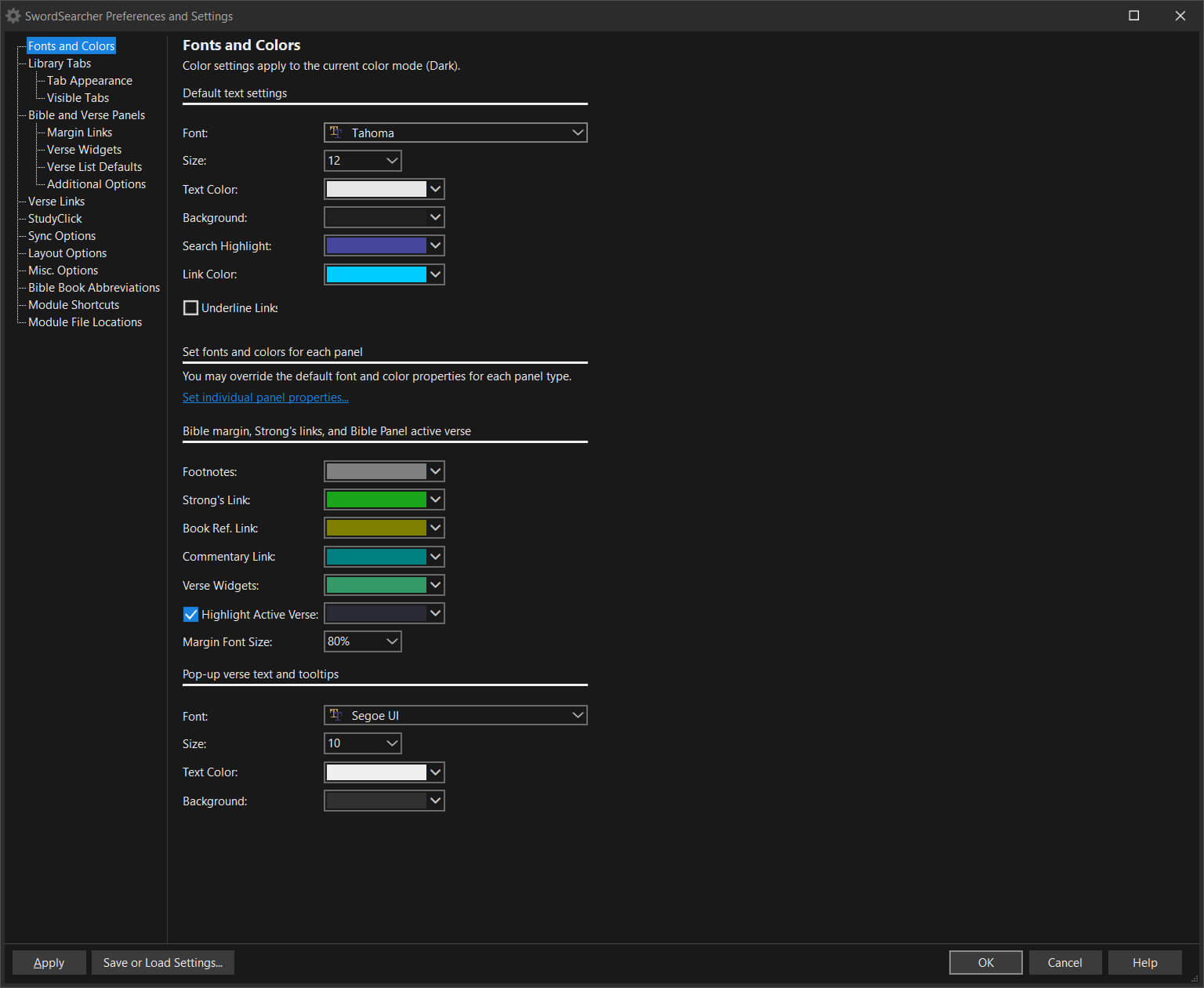
One aspect I missed from previous versions was the "single slant" tabbed UI, but I was thankful to find this too is customizable. I tweaked a few aspects, such as highlight and link colors to suit my needs. I have to say that level of personalization and attention to detail is a nice refinement.
In fact, nearly every aspect of SwordSearcher can be tweaked to some degree via the preferences menu. This includes choosing a specific typeface, font size, as well as making changes to UI colors. What's more is that this can be done separately for light and dark mode. So, if you find yourself switching between modes, each one can be specifically tailored to your liking.
You can also choose which tabs you want to be rendered, depending on which versions and translations of the Bible you are interested in. That can be toggled quickly from the tabs menu at the top of the app, by choosing either "show all tabs" or "show only my selected library tabs."
Image viewer
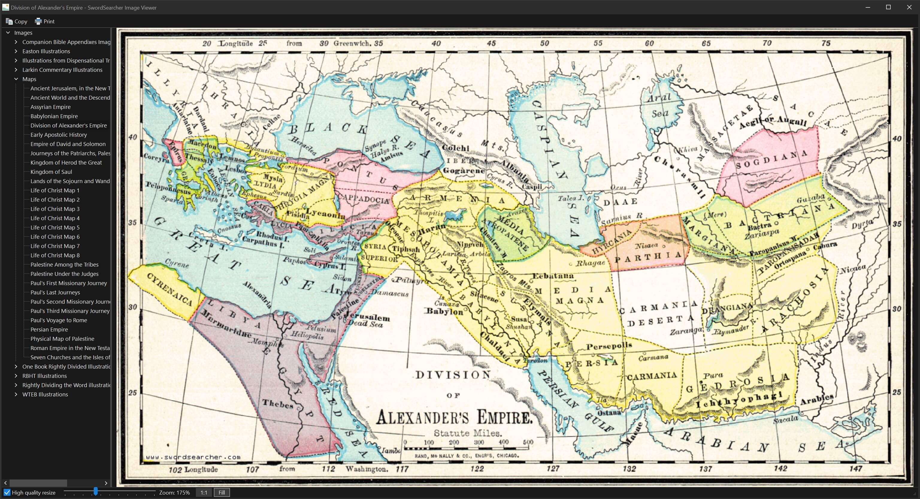
One of the tougher parts (for me anyway) when reading the Bible is attempting to visualize what is being described in my head. I am appreciative of the image viewer feature, because it removes a lot of the guesswork and estimation of measurements. There are numerous supplementary images, ranging from historical plant life, to temple floorplans, and diagrams of dispensations.
For example, depicted here is a map showing the expanse of the Roman Empire when ruled by Alexander the Great. It is helpful to visualize just how much territory Rome had conquered, which gives one a sense of scale when thinking about awaiting a messiah for deliverance.
Here is another illustration, which is a cross section of ancient Zion from west to east. It shows the vertical walls of the city, relative to the underlying elevation. There are also subterranean details included, such as the Siloam_tunnel. This is an interesting perspective (no pun intended) that is not readily apparent when reading about the location in the text.
Word cloud & tree
I am a data viz nerd, so I appreciate the ability to see various passages presented in a visual format. The word cloud view makes words larger that occur more often and can optionally be set to include (or exclude) common words such as "the." In this screenshot, we see the book of John chapter 3. At a glance, it is easy to see the major names and themes that appear throughout.
The word tree view is also helpful. It is a more exacting view of key passages, breaking down the sentence structure and relationships between words. It allows one to see the recurrence of words, in conjunction with other repeating patterns. In this example, the word "unto" is mapped to its usage alongside other phrases with commonalities.
Value & price
I suppose that value is in the eye of the beholder, but to me SwordSearcher feels reasonably priced for the sheer amount of literature and supplemental materials it contains.
- Bible versions and translations
- Exegetical study materials
- Daily reading guide
- Image viewer
- Word data viz
Also, bear in mind that some other academic Bible software will run upwards of $10k+ for their most full-featured version. That strikes me as cost prohibitive — and perhaps a bit overkill — for someone wanting to dive more into the daily study of scripture.
Summary
Perhaps needless to say, I am a fan. The dedication that Mr. Staggs has put into this app over the years definitely shows. It has been a personal labor of love since he began building it back in 1994. He continues to add more enhancements and quality of life improvements to this day, which is a testament to his craftsmanship and devotion to the product.
In terms of bespoke, indie software I would put it on par with apps such as:
For context — if you are not a developer who uses those apps — this comparison is high praise.
So, I guess the real question is:
"Should I buy SwordSearcher version nine?"
It depends. If you are a Windows user who wants to dive more into learning about the Bible, I would answer resoundingly: Yes. I consider it to be an app that is consistently best in class.


