Reflecting logo tutorial
Logo examples

I have been noticing an increasing trend around blogs and commercial sites on the 'net. It seems the reflecting logo technique is all the rage nowadays. What's odd though, is that not many people seem to be doing it correctly. Assuming the effect you're going for is text sitting on glass in a highly lit room (ala Matrix loading sequence), then I've got a few tips that will help you pull it off more effectively.
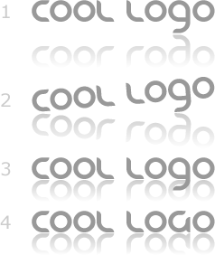
The problem I have been noticing is that people are attempting to do this technique with words that have a hanging character. Consider this generic phrase: "Cool Logo," in which the lowercase "g" hangs below the baseline. The image above depicts different ways of dealing with this.
In the 1st example, the lowest part of the word is where the reflection begins. This is all well and good, and would be fine if the effect was meant to be a shadow from a backlit light source, with the text suspended from wires. However, considering we want it to look like it's sitting on a glass-top table, then there is nothing else supporting the rest of the letters. Thus, the phrase "Cool Logo" would be tipping to equal out the weight, such as in example 2.
Example 3 is one I see a lot, in which the artist attempts to compensate for the hanging character by simply using the baseline of the other text for the beginning of the reflection. Again, if these were really letters sitting on a reflective surface, the bottom of the "g" would be punching a hole in the glass.
So, what I am proposing is that in order to use this technique, either use it on words that only have letters above the baseline, or capitalize all the letters such as in example 4. Hopefully this will make your effects work a little more believably. You might also want to consider adding a slight flattened-out shadow directly below the letters. For more on the mechanics of how to actually do this technique, check out the tutorial by Craig Erskine.