eBible - my thoughts
Recently I recieved an email from Geoff LaFleur of Godspeed Computing, inviting me to check out their upcoming eBible.com that has been making quite a buzz in Christian circles as of late. If you haven't heard of it, think of it as Bible 2.0. While I have had an account there for awhile now, courtesy of Ryan Heneise's invite, I hadn't made time to take a good look at it.
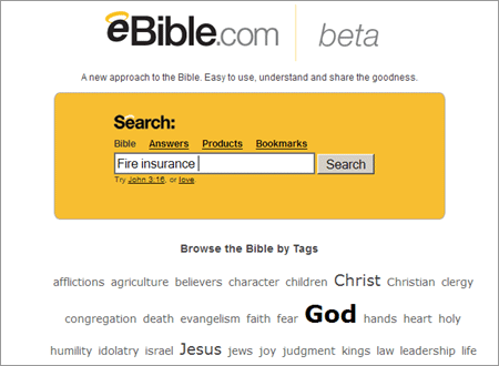
While this is not the first attempt at creating an online Bible resource, I will not be comparing it to any of the others out there. Simply put, that would be an injustice to eBible. Rather, I will be walking you through what I like (and dis-like) about the beta version of eBible. The first thing you will notice once you've logged in is the simplistic interface, which is pictured below.
Main Page

The appearance is reminiscent of the Google layout, with a search field taking prominent focus. Below that is what has come to be known as a "tag cloud," popularized by the blog aggregator Technorati. The tags are displayed proportionally to their usage in people's bookmarks, which is how eBible sorts popular topics. You can view your own bookmarks, or see the entire list made by all users, ala the functionality of Del.icio.us. Next up, the Bible interface…
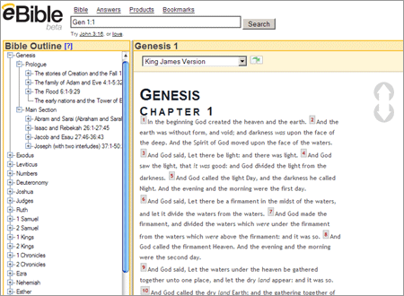
Bible Browsing

As you can see, the entire Bible is listed in the left column, and you can pick any section from there, which is then displayed in the right column. This is done dynamically without any page refresh via hidden Ajax calls. If you've not heard of Ajax by now, just do a quick search over at Godbit to see the many articles it's mentioned it in, and books on that topic we've reviewed. This asynchronous browsing experience makes it very easy to both skip through the text, as well as read through uninterrupted. My one and only qualm would be accessibility. With JavaScript disabled, it is impossible to make use of it.
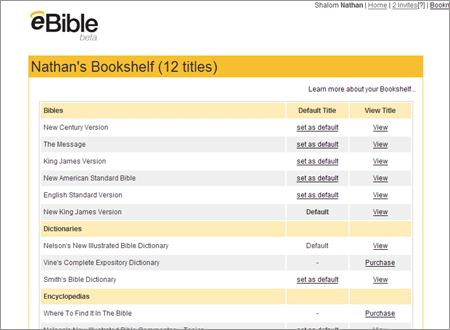
My Bookshelf

Pictured above is what's referred to as the bookshelf. Here, you can select which version of the Bible you want to serve as the default, as well as which commentaries, dictionaries or encyclopedias you want made available. There is even the option to purchase them in book form, if they are not yet available digitally. In fact, the whole eBible experience is pretty seamlessly integrated with e-commerce, but not in such a way that you feel pressured to buy anything. It comes more as a welcome convenience - I search for something, and amongst the possible answers are ways to further research that topic. It would be likened to using Wikipedia, with links to Amazon built right in.
Usable Interface

I also love the way the search integrates with the site. If I look for something like "marriage," I only have to type it in once. Then I can click categorically, and see what the Bible has to say about it, then click Answers, to see a mixture of scriptural references as well as relevant books. If I click over to Products, I can see an even fuller list of marriage related literature. Likewise, by clicking Bookmarks, I can see what other people have tagged as being relevant to my search term. This ease of use is genius, plain and simple.
Browser Integration

As if that weren't enough, you can also download a toolbar for Internet Explorer. They also have one in the works for Firefox, but for now you can just add eBible to your list of search engines, pictured above. When you use it, you are taken to the Bible search results by default - very handy indeed.
Critiques
Even in beta, it is easy to see that eBible is already poised to become the online resource of choice for both Bible enthusiasts and casual users alike. While it is a very solid product, I do have a few suggestions. First and foremost - accessibility should be a priority. I realize that it's still in beta, but this is something I hope is addressed by the public release. By the nature of its very content, the Bible necessitates that everyone have access to it.
Secondly, when I'm at the index page, sometimes I want to just go directly into the Bible reading mode. However, I cannot do this without typing in chapter and verse, or by searching for some term. As a new believer, this sort of puts a barrier between me and God's word. For instance, let's say I just want to start reading the Bible from the beginning, and do not have a particular topic in mind. If I do not know that Genesis 1:1 is where it starts, then I sort of have to arbitrarily jump in and find my way.
Summary
I think that with those two usability problems addressed, eBible.com will quickly and easily become the most widely used online Biblical resource. The guys behind it really know their stuff, and have created a great product. It must have been tough to balance the aspects of scripture and commerce, but they have done so brilliantly. I would highly recommend eBible to anyone who wants to delve into God's word, experiencing it in a community atmosphere.