CrossConnector
Take a humble heart for God, add the flexibility of Ruby on Rails, multiply that by countless hours of work, and what do you get? Answer: CrossConnector. If you have not yet heard about it, let me say this is a great new way to manage ministry events and coordinate missions trips around the world. In my opinion, it is the epitome of what churches could and perhaps should be doing on the web. This screenshot is from my personalized dashboard area, where I can manage the many features available in this fantastic web application.
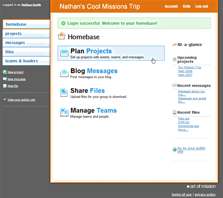
As you can see, the interface is incredibly user-friendly, with chunky clickable areas, and easily distinguishable tasks. I could just describe this as "ministry meets Basecamp," but that would not really be doing it justice. Allow me to expand upon why I like so much it. First and foremost is the intuitive way things work. One thing that bothers me about many web interfaces is the lack of clarity as to what is going on. Typically, this is a result of geeks building products for geeks. For instance, check out the following CMS screenshots.
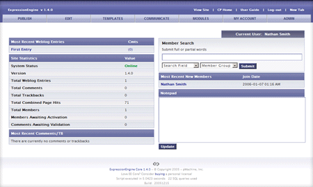
ExpressionEngine:
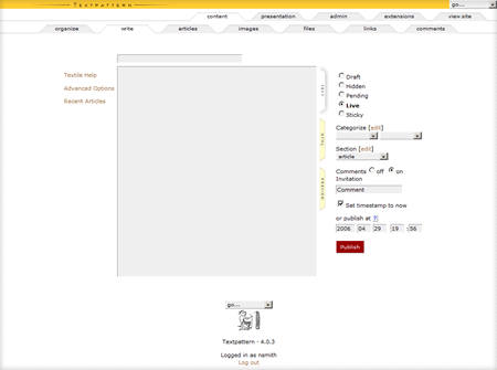
Textpattern:
WordPress:
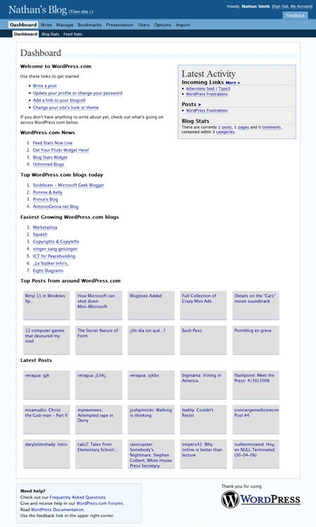
While all of the above systems are quite good, they are all designed with technically web savvy people in mind. Upon initial login, ExpressionEngine gives you a rundown of raw data statistics about your site, such as total entries, trackbacks and page hits. Textpattern is the opposite, starting you off with a blank slate for writing new content, but a new user might need a bit more guidance. By stark contrast, WordPress bombards you with information from around the web about the CMS itself, presupposing that you even care.
That's what I love about CrossConnector, the fact that it makes things so easy to understand. Clearly, there was a lot of planning involved to keep the application streamlined and concise. It does a great job of just getting out of the way, and letting you get things done. It gives you four obvious choices:
- Plan Projects
- Blog Messages
- Share Files
- Manage Teams
The interface provides you with a balanced amount of coaching to help you figure things out, while still keeping the more advanced options readily accessible. You can browse the members of your ministry team, and can collaborate with other team leaders online. There is also a prominent Help link on every page, should you forget how to use a particular feature. This takes you to an area with answerers to frequently asked questions, as well as a link to the community forum in case you cannot find what you are looking for.
Another thing I love is that when you upload an image, you can click Get HTML and it will open an Ajax textarea containing the code to cut and paste into your blog post. As far as formatting the article itself, Textile is enabled, allowing more advanced users increased control over their writing. There is also a streamlined tagging system in place throughout the various sections. For instance, if a file or image upload pertains to a particular event, I can tag those files for easy searching later, and can also tag the article itself as a way of keeping related things together.
Yet another nice feature is the way that Events are tracked. Upcoming events have little count-down notices below them, letting you know what to prepare for. It also shows a less prominent summary of events that have already occurred, with links to comments and feedback about how things went.
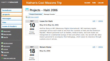
I found it especially interesting that you can plan projects that are only viewable from within the admin interface, but not on the public-facing site. At first, this did not make sense to me, but considering how many missionaries there are in countries that are not friendly to Christianity, this is a very considerate feature. This allows the missionaries and home congregations to coordinate their efforts, while not running the risk of publicly divulging a missionary's identity or location, accidentally putting them in harm's way.
I could really keep going, but suspect that you would probably learn more about CrossConnector from the actual site. Make sure to check out the videos section, as it shows the web application in use and better illustrates some of the finer points. Additionally, you can sign up for a free account and play around with some of the features yourself. The tools are flexible enough to allow for a variety of uses, some of which you can see here. It is my sincere hope and prayer that many churches will consider this as an option for organizing their outreach efforts. Give it a spin, and share with your pastor.