Consistent form styling
Well, there's only about an hour left before I leave for Gospelcon, and I am gitting a bit nervous about giving my presentation. I am sure it will go well, and have my Apple Keynote slideshow all prepared. I will be posting that after I present, as I might be adding slight tweaks here or there as I think of them.
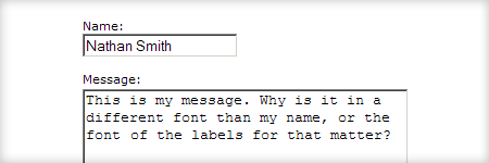
Anyway, I just had a thought that I wanted to share real quick, and that's styling form elements consistently. By default, this is what the input and textarea look like for most browsers. There is typically Arial or some sans-serif font for the text input, and then Courier New or some monospace font for the textarea. Given that the two normally are used in conjunction with each other, it is beyond me why nearly all browser makers do this.
Inconsistent:

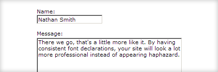
Consistent:

To achieve consistent font usage in form elements is so easy, that I find it surprising more people don't do it, even designers that I highly respect (not naming any names). I suspect that form elements are not something they really think about in their design comp mockups, so it just doesn't translate into code on their live sites. Anyway, just do this…
input,
textarea {
	/* Your styles here. */
}
Notice that I did not actually provide any declarations inside the brackets. That is because it really does not matter how you style the text inside, just as long as you keep it consistent. I think that about covers it. That concludes this brief public service announcement, thanks for listening. Go fix those forms!