960 Grid System
If you use the 960 Grid System, check out the companion JS file: Adapt.js
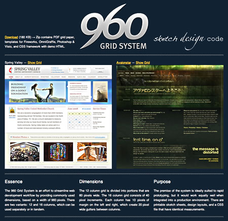
As you might have heard, I recently launched a site for the templates that I created to use in my personal and professional projects. For lack of a better name, and because the numerals made for a nice logo, I've decided to simply refer to it as the 960 Grid System. It's funny, because even though all I did was post a single tweet about it before going to bed Sunday night, viral word of mouth kicked in, and I'm already getting inquiring emails.
I should note that the 180 KB download size isn't for the CSS framework alone. That download bundle is for all the files: printable sketch sheets, design templates for Fireworks, Photoshop, OmniGraffle and Vision + the CSS and HTML. The 960.css file itself is only 3.6 KB when compressed.
First of all, I made this for myself, to scratch an design itch. Not everyone will like it, and I'm okay with that. There's an old saying: "You can please everyone some of the time, and some people all of the time." I am not trying to accomplish either. I am simply sharing the grid dimensions that I have found myself gravitating towards over the past year or so. If others can benefit from that, then all the better. That being said, read on.
Browsers
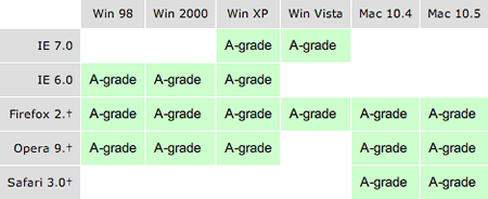
I built the code in my grid system to accomodate all A-Grade browsers, as determined by Yahoo. At the time of this writing, that chart looks like…

Note that IE5.x is nowhere to be found. That's for good reason. There's not enough market share for it to be important to Yahoo. Not only that, but even Microsoft has discontinued support for it. If you're stuck in a position where you're still having to code for that ancient browser, the best suggestion I have is to go peruse Authentic Jobs and find better employment.
Background
I first became interested in grid design via reading articles by Khoi Vinh and Mark Boulton. Initially, I must admit that I didn't fully grasp the concept. But, the more I thought about it, the more I realized that this time-tested practice from printing works well on the web. Like it or not, web pages essentially revolve around boxy shapes. Inevitably, these rectangles have to come together in some way or another to form a design.
As long as we're using shapes consisting of right angles, we might as well make some logical sense of it all. Some time after the intial work of Khoi and Mark, I happened upon an article by Cameron Moll, heralding a width of nine-hundred and sixty pixels as the optimal size for design. Basically, 1024x768 is the new 800x600, and 960 makes for a good magic number to utilize the wider canvas on which we paint.
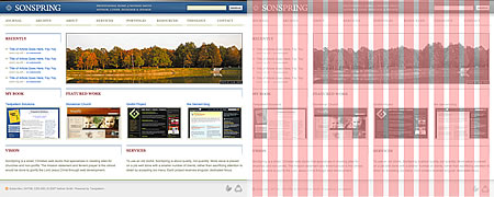
After that seminal article, I have been basically designing on some subdivided variant of 960 pixels ever since. Last spring (2007), I found my groove, so to speak. It happened when I began to redesign my personal site. It's still in the works, but here's a sneak peek. As you can see, I'm eating my own dog food, as the future version of my site will use a 16 column grid.

I have yet to sit down and complete the redesign, since I am still finishing up my masters degree via correspondence, and because other paying freelance work came up, plus day job, etc. Chronologically though, I technically "began" work on my grid system before the release of Blueprint.
That's not a value judgement, but helps to explain "why another grid framework," because I had already started down that path by the time Blueprint was announced. I have used BP, on a project where I was required to use a documented code base, to ease future maintenance of the site. Though it was agreed upon, the designer on the project didn't design according to BP's dimensions. That was partially my fault, for not better communicating how it worked. By the end of the project, I had basically overridden nearly everything BP brought to the table.
That's when I got to thinking, wouldn't it be great if there was a way to streamline things, to get designers and developers thinking and communicating better? And, what if IAs were included in that workflow? That inevitably led up to what is now the 960 Grid System.
What it's not
By far, the most common question I have received via email has been "How does this differ from Blueprint?" People seem to ask the question almost antagonistically, as if to say — "You're wasting your time, because Blueprint already exists, and I like it better, so nanny boo-boo."
For those people, I say, bravo. Please, continue to use whatever works best for you, and whatever you are most familiar and/or comfortable with. I am certainly not looking to draw up battle lines, or trying to change anyone's mind about what framework to use, or even if one should be used.
One of the glaring omissions, or nice features, depending on how you look at it, is the way the 960 handles (or doesn't) typography. There is a text.css file included, but this is mainly to ensure that there is at least a something in place, so that as you do rapid prototyping, common elements such as headings, paragraphs and lists have basic styling.
I haven't gone out of my way to establish a vertical rhythm for text, as is described in the Baseline article on A List Apart. It's not that I don't see the value in it, I do. I think it's an awesome idea, and a noble pursuit. However, it is fragile. All it takes is for a content editor to upload an arbitrarily sized, 173 pixel tall image, and all the subsequent elements are off-beat.
I see this as being more of a design choice, than something that needs to be standardized. In fact, most things that might be considered unique to a site design have been left out. I have specifically not set any text or page background colors. Call me lazy if you want, but that's one thing I found myself consistently overriding when using BP. I'd wonder things like: "Why is there a <th> background color?"
I have also not put in pull or push image/quote styles, as those are things I rarely use, and I consider that to be a bit more design and contextually content oriented than related to page layout and prototyping. It'd be easy enough to write as a one-off in your own design stylesheet.
So, I hope you'll forgive me if my grid system isn't all you think it should be. Much as I like the The Beatles, I don't exactly want to hold your hand.
Texting
After that underwhelming explanation of what the 960 Grid System doesn't do, let me highlight what I consider to be the features. First off, some love for Linux users. The default font-family order is Helvetica Neue, Arial, Liberation Sans and FreeSans, with a generic fallback of sans-serif.
One thing I've found about Ubuntu is that the default sans-serif font is actually closer in width to Verdana than Helvetica or Arial. It's not a big deal, but if you want text that looks relatively the same cross-browser, you need more than just a generic fallback for Linux users. This can be especially important if using the size of a particular font to approximate a certain width. It stinks to see carefully crafted navigation break to the next line.
In talking to my friend Yannick, he advised me that Liberation Sans is available by default on both Fedora and Red Hat distributions of Linux. It is also freely available under the GPL, so what's not to like? If I had to describe it, I'd say the numerals are reminiscent of Verdana, but the rest of the characters map nicely to the dimensions (if not glyphs) of Helvetica.
From what I could tell via Jon Christopher's article, FreeSans is the nicest looking equivalent to Helvetica available by default on Ubuntu. So, the text.css font-family list handles OSX, Windows, Linux builds.
Sizing + Spacing
Before we get into the pedantic debate about pixel font sizes, let me just say — Let's not go there. I'm aware of all the arguments, and have even toyed with making elastic layouts. For me, it's about ROI. You can spend countless hours toying with font-size inheritance, like I did on the Geniant Blog, or you can set sizes in pixels and get on with your life.
I'm aware that Blueprint's text equates to 12px, but 13px is what YUI's fonts.css file specifies, and I actually quite like the way they've done their typography, aside from percentage based sizing being a bear to wrangle. We used it on the Geniant Blog, to great (albeit time-consuming) effect.
While I haven't painstakingly set a vertical baseline, body text is 13px with a line-height of 1.5 (unit-less) = 19.5px. Most block-level elements have a bottom margin of 20px. So, that right there gets you pretty close to a consistent baseline. Just need to tweak line-heights on headings, etc.
The two block-level elements to which I did not apply bottom margin are blockquote and form. In strict doctypes, both of these require other block level elements to be inside of them. For instance, paragraph tag(s) inside a blockquote or fieldsets in a form. By not having any margins themselves, other blocky children can stack neatly inside.
I've also re-indented list items by 30 pixels on the left, so if you want hanging bullets, be sure to set that back to zero. I actually think hanging punctuation is pretty cool, but have yet to meet a client who agrees, so I erred on the side of caution in my CSS, in hopes of mitigating future arguments.
:Focus
I just wanted to briefly mention this, because it has to do with accessibility. While I personally think that Eric Meyer's reset.css removal of :focus outlines is aesthetically pleasing, I think the right thing to do is to retain focus borders, for users that navigate links via a keyboard instead of a mouse.
This has been a longstanding gripe of mine with the Opera browser — the utter non-existence of any sort of :focus indicator. Anyway, you can remove the a:focus code in text.css if you want to have cleaner looking links, but know that you do so at the expense of accessibility.
Columns
One of the key differences between Blueprint and 960, aside from nomenclature, is the way the grid columns receive their gutters. In Blueprint, all the gutters are 10px wide (a bit too narrow for my taste), and are to the right side. The last column in each row needs class="last" to remove the margin. This means that neither the left nor right sides of a container have any spacing. For the most part, this is no big deal, but if a user's browser is constrained, body text actually touches the browser chrome.
In the 960 Grid System, each column has 10px margin on both the left and right sides. This allows for the overall container to have a 10px buffer at the edges, and the margins combine between columns to form 20px gutters (a bit more room to breathe). Additionally, there is no need to add an extra class for the last column in a row.
In some unique cases, you might want grid units nested within a parent grid unit. In this case, you will need class="alpha" and class="omega" on the first/last child in each row. It's a bit more work, but is more of a fringe situation, so it won't come up as often.
I specifically chose grid_XX as the naming convention because for some reason, having a class named span-XX bothered my brain, since <span>, <td colspan="X"> and <colgroup span="X"> already exist in HTML. I guess I just like the idea of there not already being several tag/attributes with the same naming conventions. I also disliked the monotony of typing class="column …" repeatedly, though to their credit, the BP guys have eliminated that necessity in their most recent build.
Much like with Blueprint, you can add empty columns before/after a grid unit, by specifying a class of prefix_XX and/or suffix_XX. The naming convention there was simply one of personal preference, as I admittedly tend to get confused by the word append, forgetting if it goes before or after.
Internet Explorer
Someone emailed me today asking about IE compatibility, and why there is no ie.css file included with 960. Simply put, it wasn't needed to fix any of the grid aspects. IE6 has a wicked bug which doubles the margin on any floated elements. This could be a huge problem, but is easily fixed by adding display: inline to that which is floated. This causes no side-effects in any other browsers, so it simply lives in the main 960.css file.
You may find that IE6 and IE7 both get the spacing around <hr /> slightly off, by 7 pixels above and beneath, which is easily fixed by adjusting margins accordingly. To me, that's an acceptable issue, and not really worth adding another CSS file with conditional logic in the markup. If you do end up creating a separate IE stylesheet, keep that in mind, and address it.
In the Clear
Lastly, I wanted to talk about the clearing methods included in the 960.css. First off is my personal preference, adding an innocuous bit of markup to clear all elements. I have already written about it extensively, so I won't go over all that again. Basically, add class="clear" to a <span> or <div> that you want to disappear. The only effect it will have is to clear floats.
The other method is for all you markup purists out there, who don't want to dirty your HTML. Instead, you can insert markup via your CSS. This technique is well documented already as well. Essentially, add class="clearfix" to elements to clear what's contained inside them.
Licensing
The whole bundled package is free of charge, dual licensed under GPL and MIT. While I'm no suit, it is my understanding that these two licenses ensure that you can use the grid system in just about any situation. I must especially thank my friend Michael Montgomery for his informal advice, helping me to wrap my mind around all the legalese. He is a patent attorney by day, web ninja by night, and helped me wordsmith the 960 copy.
Finito
That's all folks. Hopefully you'll find the 960 Grid System to be helpful in sketching, wireframing, designing and/or coding. Future plans include a tutorial on how to use jQuery to add styling hooks to form elements, since I know from experience that is no cup of tea. I'm not sure JS belongs in a CSS framework, so I might just make that a separate tutorial series.
