Minimal logo design
![]()
Today, my wife and I spent the better part of our rainy afternoon at the H&R Block office. I say that not to complain, but to bring up something that I found quite interesting. Their signage was all quite nice, and the office was painted to match their branding. Overall, we had a very pleasant experience, and were helped by this elderly woman who got all our paperwork sorted out for us. Off-topic, it felt awesome to finally be able to file taxes as something other than "full-time student."
Anyway, I digress. I found it very odd that their logo is a green square. As far as I can tell, they are a well established financial consulting company, with offices spread throughout the nation. They help with taxes, mortgages, and offer a slew of other money-related services I'm sure. So, I suppose it is puzzling to me that such a huge company has such a simplistic logo.
![]()
Still, there's something to be said for simplicity. For instance, the green square you see here is the logo for Forty Media, a highly capable web design studio based in Phoenix, Arizona. Even though they are both green squares, the simple shift in color means entirely different things to my mind's eye. #66CC33 stands for friendly tax service. #668800 stands for a cool web designer with shuffleboard skills.
![]()
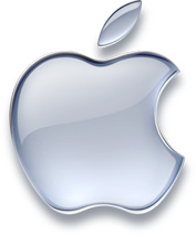
I suppose it makes me wonder why so many other companies have such wildly unsuccessful branding, when simplicity seems to sell just as well. For instance, JCPenny has a long-established brand of their company logo written in a thin white font, placed over a solid square, which varies in color for seasonal advertisements. Lately though, I have taken notice and been amused by their TV ads, sporting a new "aqua" look to the square of the logo. I suppose it's nice to see Apple's brand influencing mainstream advertising. I can't help but wonder, if by applying this effect to everything, companies aren't actually diluting their own branding.
![]()
This is a brand that needs no introduction. Arguably, Nike is one of the singlemost recognizable brands in the world. It is unique in that it is dependent on neither language nor coloring, but is based on a symbol that is universally recognizable. This affords Nike quite a bit of flexibility in presenataion, while still ensuring that people remember it.
Right up there along with Nike is the branding for Coca-Cola, which is only slightly diminished in its recognizability because of the fact that it is based on lettering which has to be translated into various regional dialects. Still, the style of the script and the prominence in coloring make it quite distinctive. Other good logos that spring to mind are Cingular, Chevrolet, Volkswagen or just about anything created by legendary logo designer, the late Saul Bass. For more contemporary logos, go see Ryan Ford's identity portfolio section.
Hopefully, Andy Rutledge will be happy I've written this article about design. For further advice on branding, check out Lea's guide to self-branding, who herself has quite a cool logo. If you look closely, you will see that it not only spells Lea, but also looks like a cartoon of a girl raising her arms in triumph. For a great article on branding a website layout itself, based on a supplied color scheme / logo, check out Greg's article on Airbag about Ma.gnolia.
I could go on and on, but I think you get the idea. Great logos are those that shine with or without color, are easily recognizable and just "work," without extra graphical effects. The Apple logo works equally well with an aqua effect, or without it. When designing your next project, shoot for a distinctively new look, and try to make it unique unto the company that you are representing.